Business Cards with UtilityA business card that you can use! A very clever form of branding has been used to produce a cheese grater business card. Makes sense, it’s for a cheese shop in Brazil. What’s striking is not only the novelty of it being an actual utensil, but it has everything a business card should have. Printed at the top is the logo, name, phone number and address. Watch this video to see the card in use. Stylish Foil Printed Business CardsWhen you need to make a classy business impression, these black suede onyx business cards will stand out with their brilliant texturing and foil printing. This suede business card is thicker than a normal one and able to be customized by the team at Clash Graphics of Atlanta, or submit your own print ready file to their website. 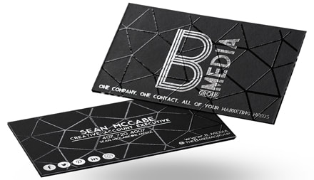
Black suede onyx business cards with foil printing by Clash Graphics.
They can be foil printed front and back, adding to their outstanding visual appeal. Soft to the touch, visually appealing, and well designed. These aspects work to make this business card further your branding while providing a memorable and different impact. For these clever and unique printing materials, these guys are the best printer in Atlanta but ship products nationwide. Here is a map to their Atlanta Printing location: Packaging, Quality Printing and DesignConfection Oven in San Diego, CA together with KLS Graphic Design has created a clean and striking packaging concept and design for their French macarons. 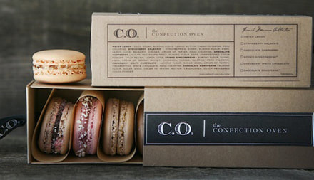
The Confection Oven by KLS Graphic Design.
It’s a “cardboard-esque” box in a sleeve with a paper insert gently keeping the macarons separated. To pull the box from the sleeve, there is a branded ribbon riveted to the end. The sleeve is neatly branded with their logo and name in white lettering on a black background creating a simple, but memorable design. Book Cover Design and Binding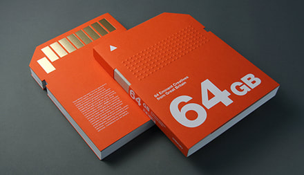
64GB by Viction:workshop and Viction:ary
A book that highlights 64 of the “freshest innovators” in Great Britain has an impressive amount of marketing, thought and ingenuity in its own brilliant and detailed design. Authored by Viction:workshop and published by Viction:ary, it is titled 64GB. The book and its jacket are bright orange with white lettering and shaped like a device’s memory chip. When you pull the book from the jacket, there are 9 foil rectangles along the top of the soft cover representing contact points. Logo Design and Printed Materials
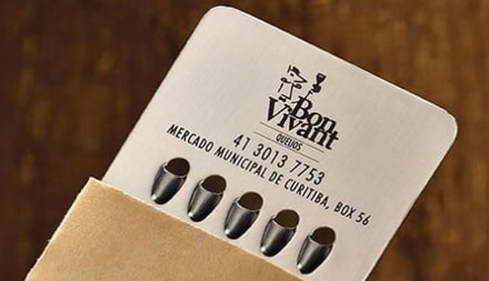
OMACCHAYA by Mortise Design
A company’s logo design and use should work to strengthen the brand it represents. A great example is the logo and printed material from Omacchaya (translated as “The House of Matcha”), French makers of artisanal Japanese teas. Their logo, created by mortisedesign.com is inspired by the traditional Japanese KAMON(family crest) and Western architectural aesthetics, combined with the shape of tea to make the logo reflect the company concept. "Connect the East and the West" The consistent use of black, silver and Omacchaya green on white media throughout all of their printed materials and packaging makes for a stunning contrast to the bright color of their tea selection. All of the graphic design has been kept simple and clean. Visually, they have succeeded in establishing and strengthening their concept and brand. Your Printed Material, Designs, and BrandingWith a clever concept and well designed marketing strategy, your branding efforts can propel your business to new heights. Quality printed materials give you the potential to make a tremendous business and branding statement, as you can see in the examples above. In many cases, it all begins with a logo design and a business card. From there, your only limitation is your own creative vision. Sources:http://omacchaya.com/ https://fromupnorth.com/packaging-inspiration-688-6842cfe24382 http://www.kristinsartore.com/ http://incrediblethings.com/work/business-card-is-a-mini-cheese-grater/ https://www.huffingtonpost.com/2013/05/15/cheese-grater-business-card_n_3281108.html http://www.clashgraphics.com/22pt-black-suede-onyx-business-cards/ http://www.victionary.com/product/64gb/ 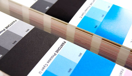 Layered vs. Uncoated
If you have a Pantone Solution Overview, or if you have actually utilized any type of layout events like the Adobe applications, you understand that Pantone colors are provided by number. As an example, PANTONE 185 is a bright red, while PANTONE 355 is kelly environment-friendly. These shades have a letter after the number, C or U. Older workshops could identify these colors as CVC or CVU (for "Computer system Video Coated" as well as "Computer system Video Uncoated"), however this has mainly been left. Either way, when you see these letters they describe the kind of paper. C means "layered" and U represents "uncoated." In some unusual instances you may see an M for "matte," which is still technically a covered stock. Around the world of Pantone though "covered" suggests GLOSS covered ... as in, shiny paper. In this post, when you see "coated" you'll know we mean "gloss coated.". Layered documents have a smooth coating, where the flyer paper is pushed and polished while warm or fit to be tied during the production procedure. This covering makes the paper less absorbent as well as takes ink better. Consider it as the coat of primer you would certainly utilize before painting your walls. Uncoated paper is merely that; paper without the coated layer. It's usually made use of for letterhead, printer paper, copier paper, and so on. Occasionally it will be classified as "bond" or "creating," however those are merely other methods of stating "uncoated." it's reasonable to claim, if covered paper is less absorptive (like a wall surface with primer) compared to uncoated paper is even more absorbant (like a wall WITHOUT primer!). Despite whether a shade is C or U, the ink is made the same. The image to the right reveals that PANTONE 293 C and PANTONE 293 U look and feel really different, however are made from the exact same formula (equivalent parts of Reflex Blue and also Process Blue.) Given that covered documents enable the ink to rest on the area, it stays abundant and also vivid. The uncoated sheet allows more ink to be taken in into the paper. Occasionally the minerals made use of as pigment to color the inks result how it will certainly taken in and impacts the shade. Notice PANTONE 290 C and PANTONE 290 U are closer in shade. This shade is made primarily from Transparent White (which you'll remember is basically "clear" and permits more paper to show though the ink.) Considering that just 3.2 % of the combination is true pigmented ink, it's much less influenced by the layered and uncoated paper. As a result, covered and also uncoated versions of lighter shades like yellow and light shades of blue, red, or eco-friendly, will certainly match a lot more closely, while darker shades and colors will look various ... occasionally REALLY various. In fact, some developers will certainly go as far as to choose different spot shades for their files, depending on the stock that's utilized. PANTONE 710 U don't really match PANTONE 710 C very well, but PANTONE 185 U does match relatively well. The color difference in covered and also uncoated stocks is also true for Refine Color styles, though for somewhat various factors. Refine shade enables a larger selection of colors due to using halftones and mixing tints of each process shade. Everything is composed of dots; large dots, little dots, but dots however (if you need an aesthetic, check our previous blog Area Shade vs Refine Shade.) These dots of differing sizes are most likely to be impacted by something called "dot gain." Remember how uncoated stocks are more absorbing, which means they will be more probable to create the ink dots to swell somewhat? This is dot gain. Most every person knows the Bounty Paper Towel commercials, where the paper towel is used on a small spill and also as the towel absorbs it, the spot on the towel spreads out. Ink on uncoated paper does a comparable point, so a halftone dot of magenta that's established for 50 %, can inflate to 55 % on some stocks as well as creating the color to change a little. The bottom line is, whether you pick a covered paper or an uncoated paper for your job, you'll want to work very closely with a printing ink expert. They can always offer you with coated or uncoated chips of various Pantone shades. You can additionally ask for a Press Proof, where you can see an example of the final version that's produced on the press. |
AuthorThis site is your graphic and print design resource. Comment on posts and let us know what you'd like us to cover next. Archives
May 2018
Categories
All
|
 RSS Feed
